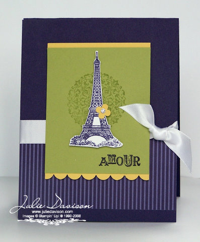
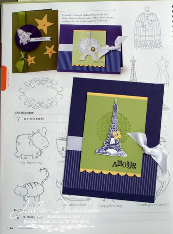
 Last night I was looking for a card to CASE for this challenge and found one on page 76. The main image is the Eiffel Tower, but since I didn't have that stamp set, I used the Eiffel Tower image from Artistic Etchings instead. Because it's a taller image, I also changed the orientation of the card.
  I love the way it turned out! And I didn't have to "think" too much about it! I challenge you to CASE this catalog too! There are hundreds of samples just waiting to inspire you! Leave me a comment and let me know how the new catalog inspired your project!
Supplies: Artistic Etchings, Concord Crush ink & cardstock, Pear Pizzazz ink & cardstock, So Saffron cardstock, Whisper White cardstock, In Color Patterns DSP, Whisper White Satin Ribbon, Itty Bitty Shapes Punch Pack, Basic Rhinestones Jewel Accents, Scallop Edge Punch, Stampin' Dimensionals
Click HERE to Order Stampin' Up! Products Online, Anytime!

3 comments:
This is soooo chic! Love these colors together and truthfully...I like yours better than the one in the catalog! ;-)
Another simply beautiful Julie card. I love your style.
Julie - Thank you for the link to the "recipes" for the projects in the catalog. I figured it existing, but I didn't know how to find it.
Nancy B.
Post a Comment